
Aqua Voice
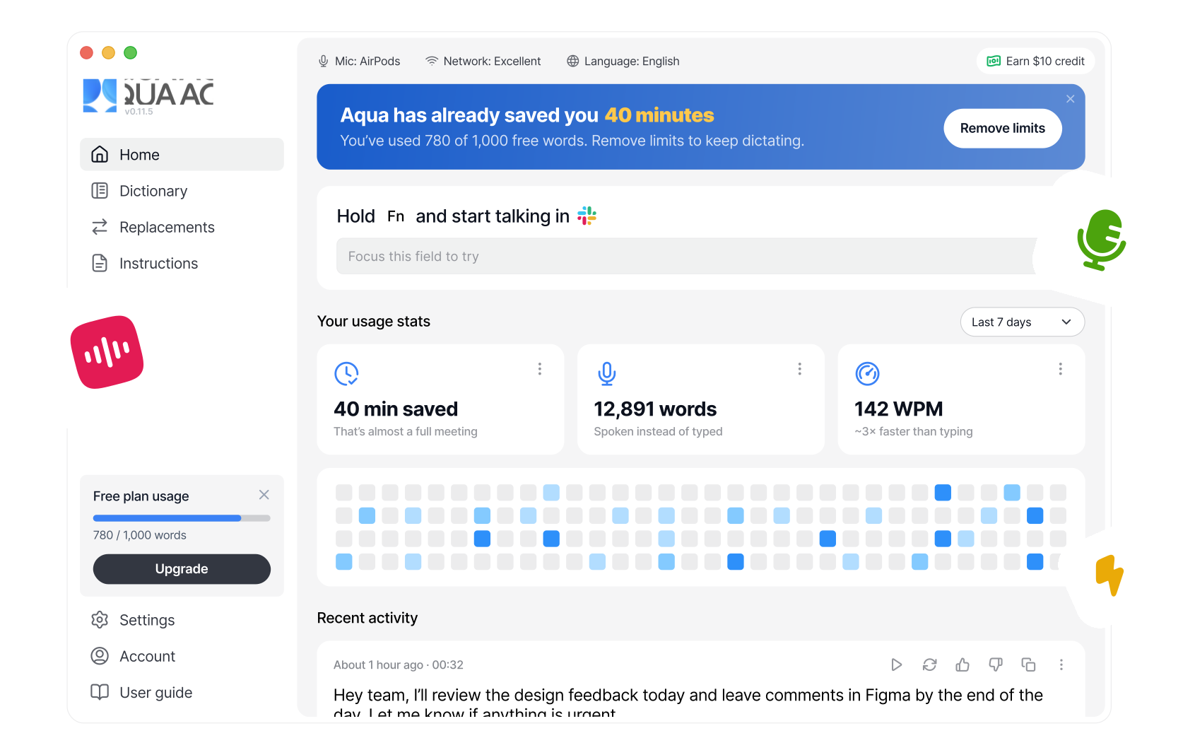
Turning a configuration-heavy first screen into a clearer starting point for a voice app.
Role
Product Designer: UX, UI, interaction design and feature integration
Challenge
Make the first screen easier to understand while retaining the settings and controls existing users relied on.
Goal
Help people see how to start dictating and what the product has already helped them do.
Overview
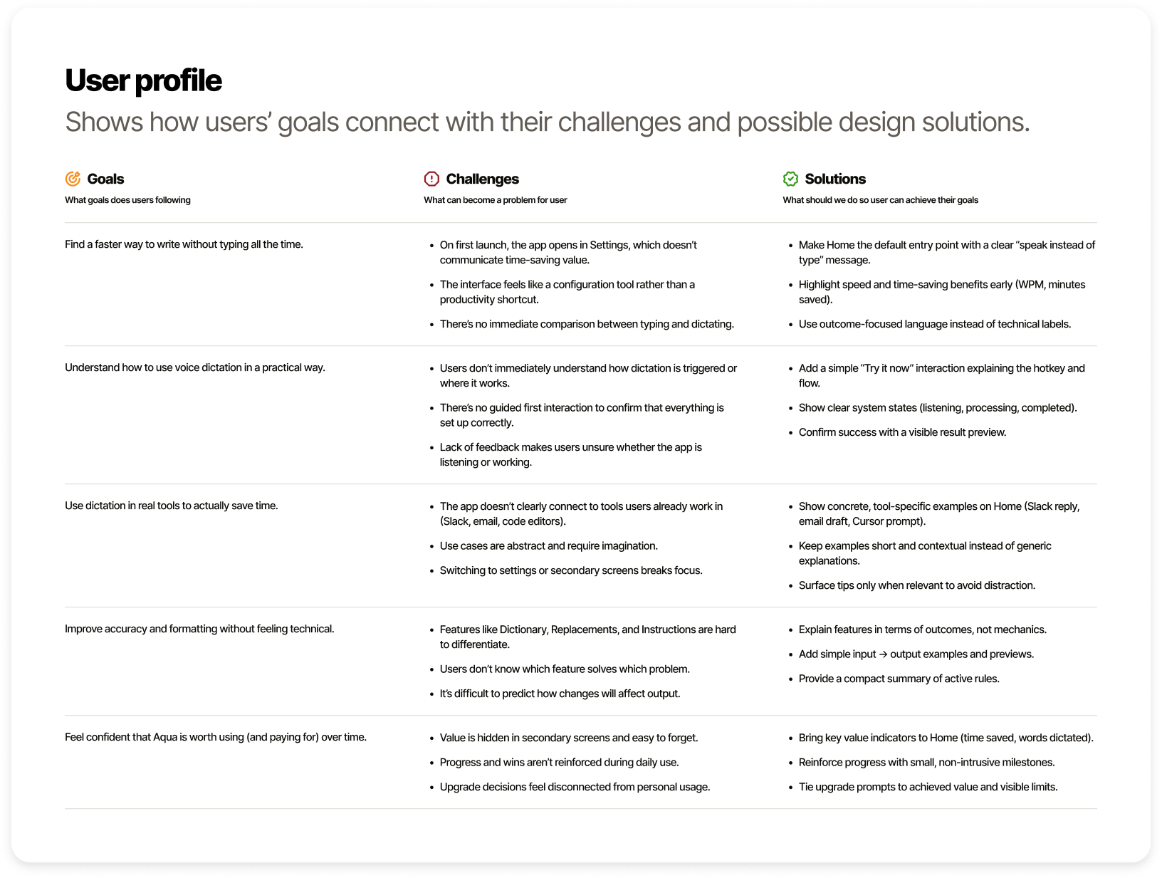
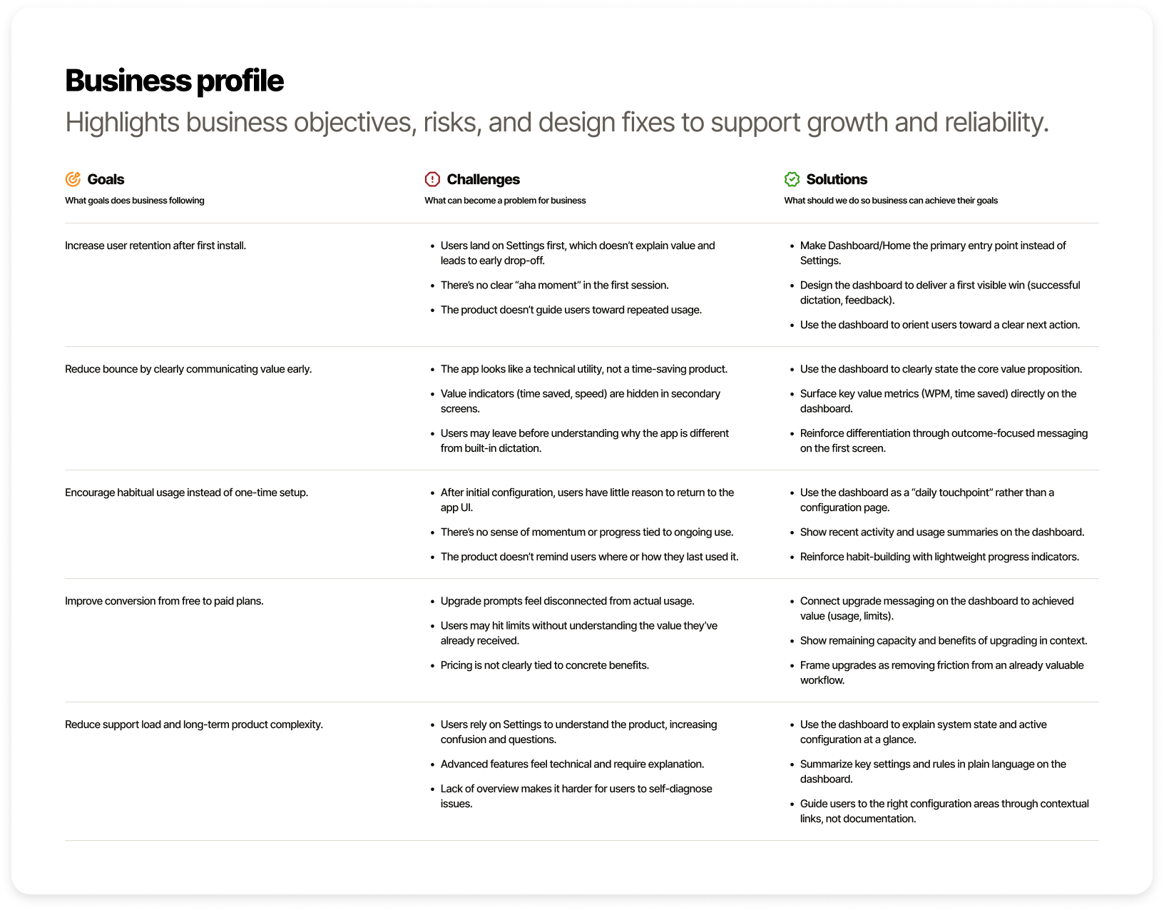
User and business goals in one map
Before moving into interface changes, I mapped both the user and business perspectives. I defined their goals, key challenges and possible solutions in one structured view. This helped align usability improvements with retention, clarity and growth objectives instead of treating the dashboard as only a visual redesign.
The brief
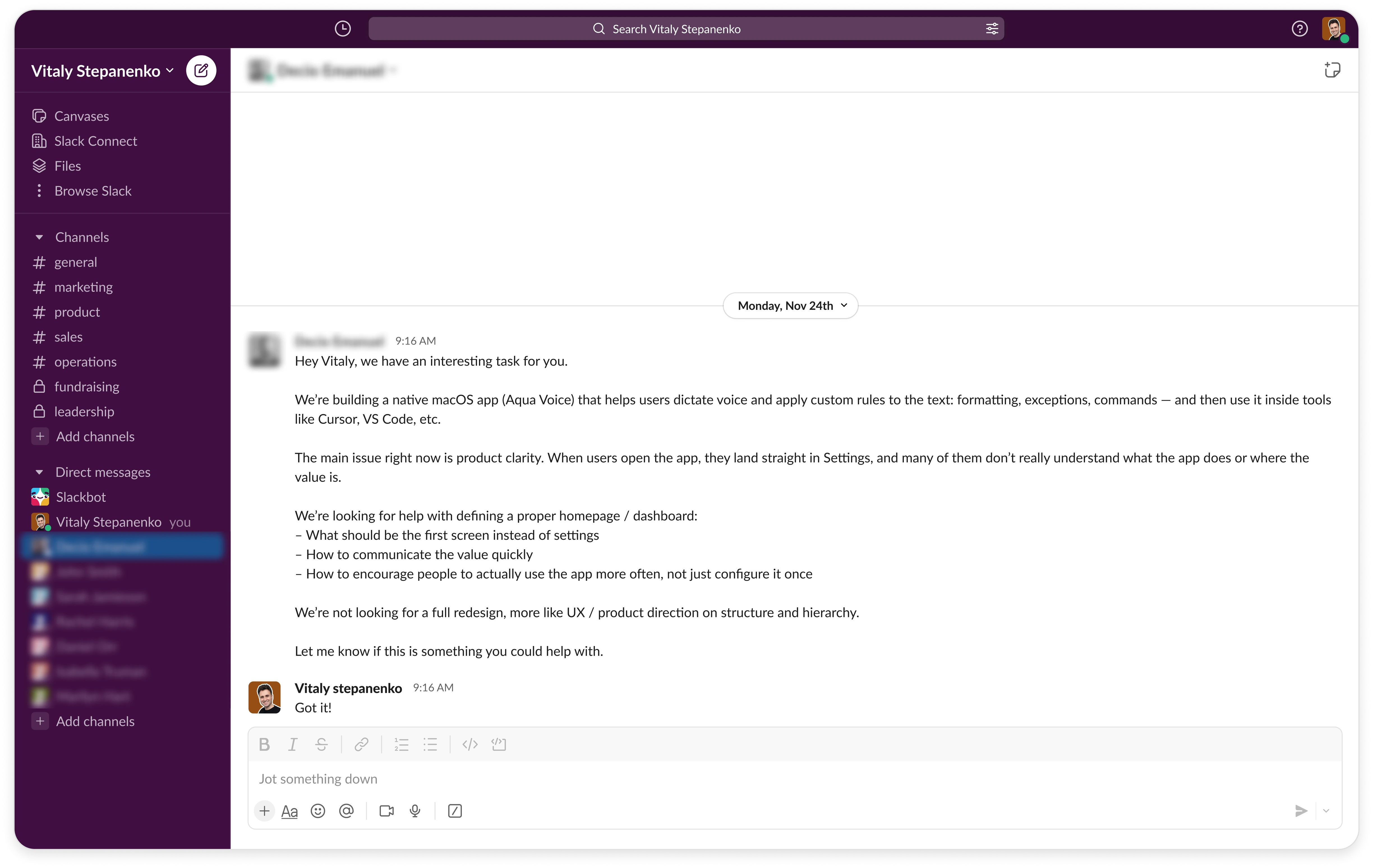
The first screen needed a clearer purpose
The client wanted people to understand the app’s value when they opened it, rather than landing directly in settings. The brief was to improve the product direction and hierarchy without redesigning the entire app.
Starting point
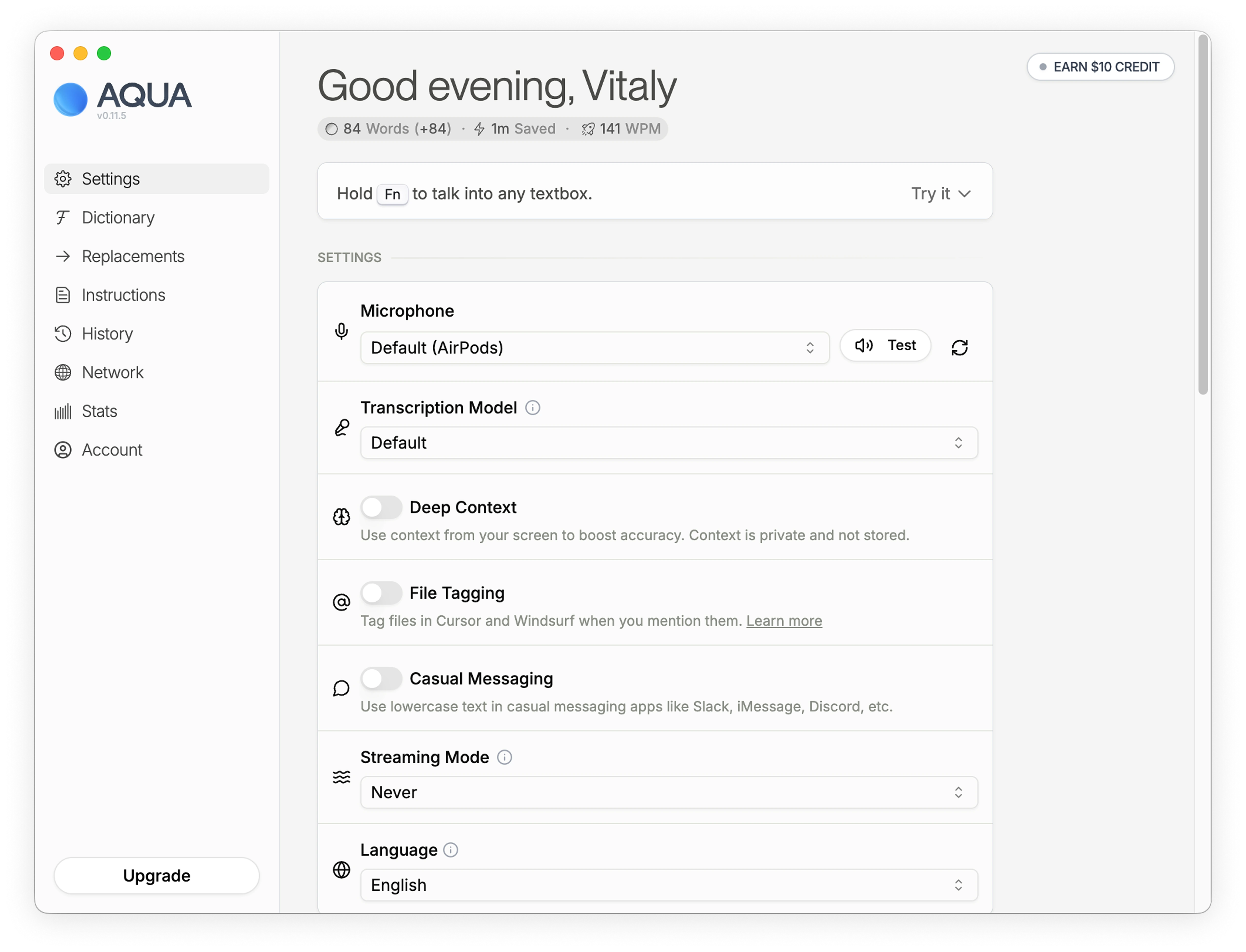
The first screen was mostly configuration
The original first screen showed many settings immediately after opening the app. It gave people control, but buried the main action: dictating into the tools they already use.
Exploration
Look beyond the closest competitors
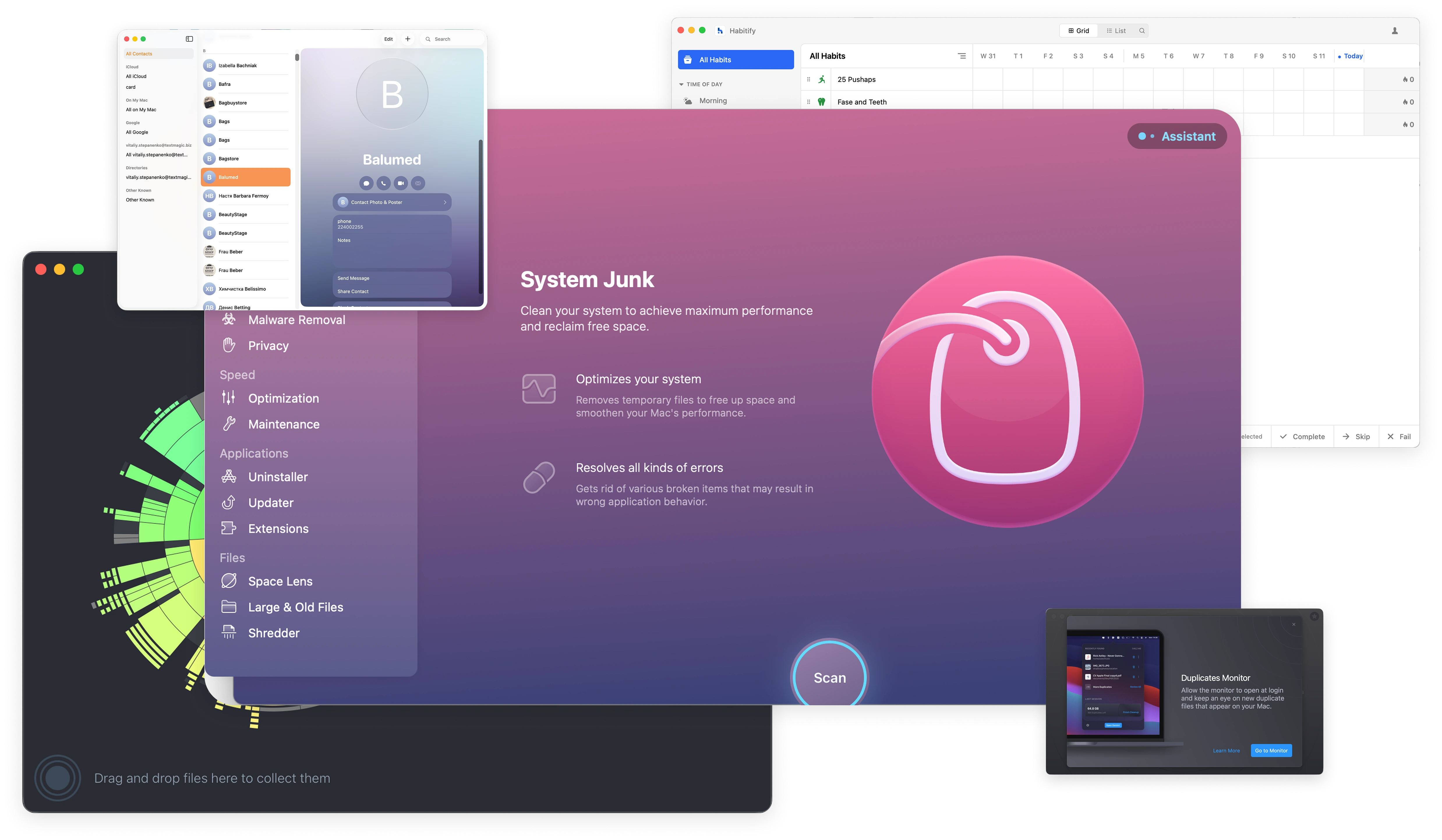
Instead of focusing only on direct competitors, I explored strong native macOS apps from different categories to study layout patterns and interaction models. I wanted to avoid category clichés and approach the dashboard from first principles, guided by the user and business journey map.
Design process
In this section, I want to walk you through the improvement process step by step. Instead of presenting only the final result, I show the idea flow behind each change and how the dashboard evolved from a configuration screen into a clearer product entry point.
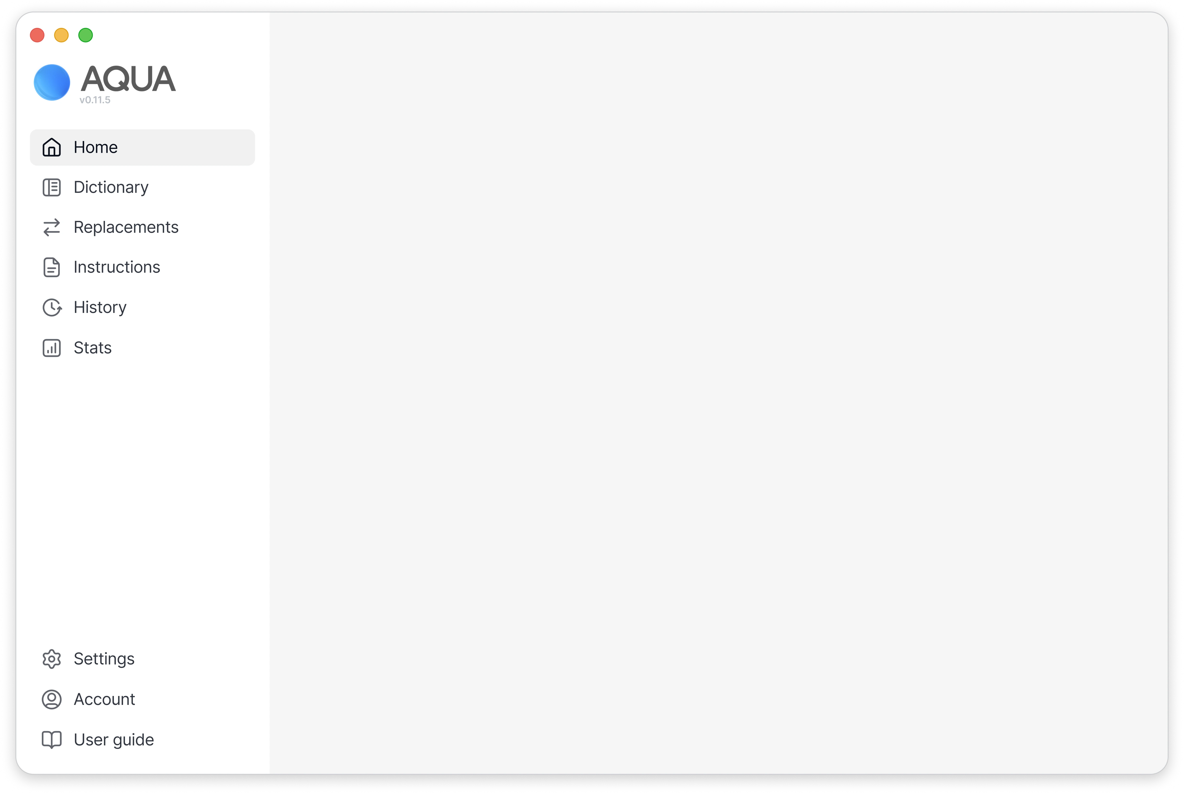

Improved side menu structure
I split the side menu into primary and secondary sections to reduce visual noise and create clearer structure. Core product areas are grouped at the top, while settings and account-related items are separated below, making the navigation less crowded and easier to understand.
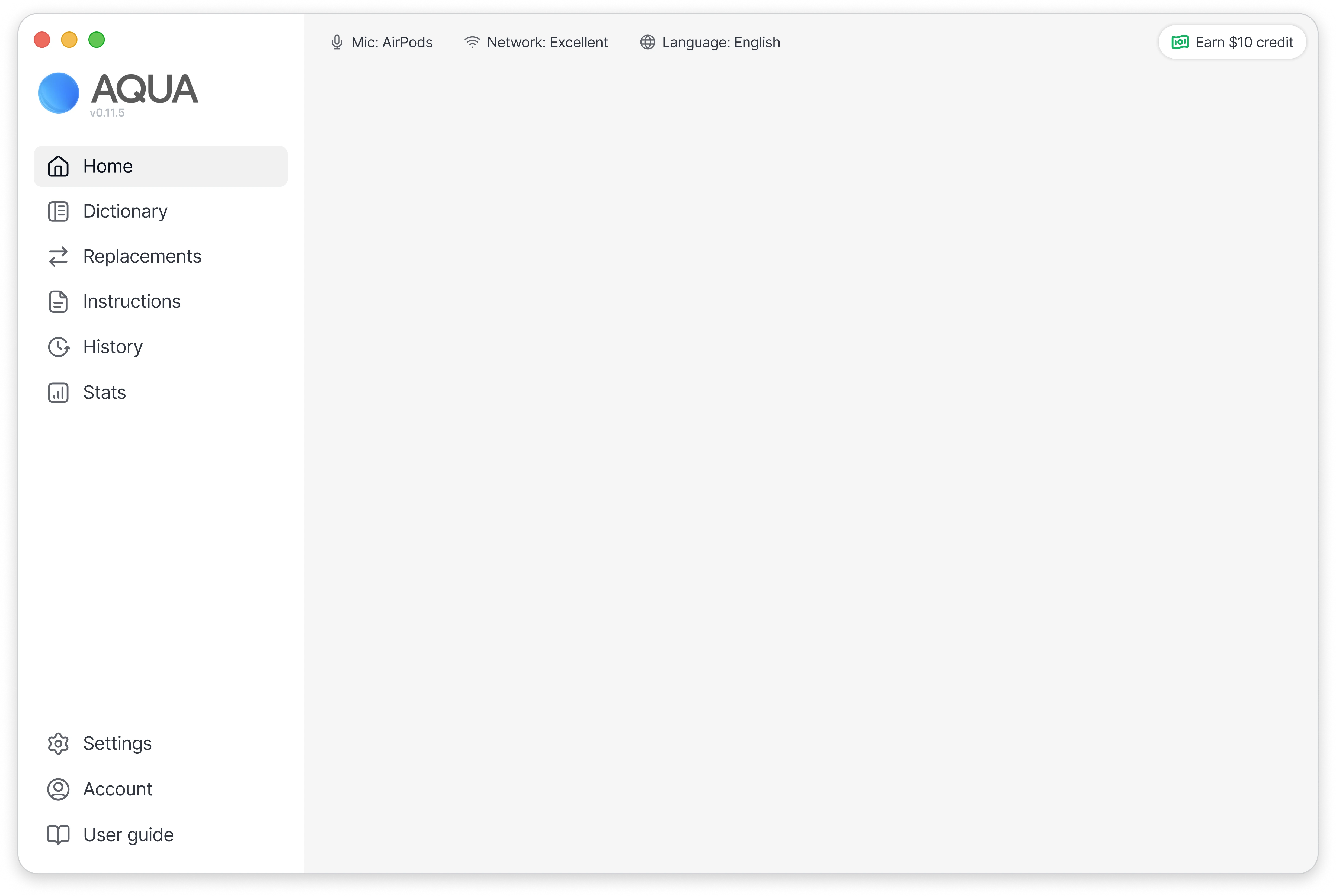
Recording readiness in the header
I added key statuses to the header, including microphone state, network connection, and current language. These elements are always visible, so users can instantly understand whether the app is ready to record, without digging into settings.
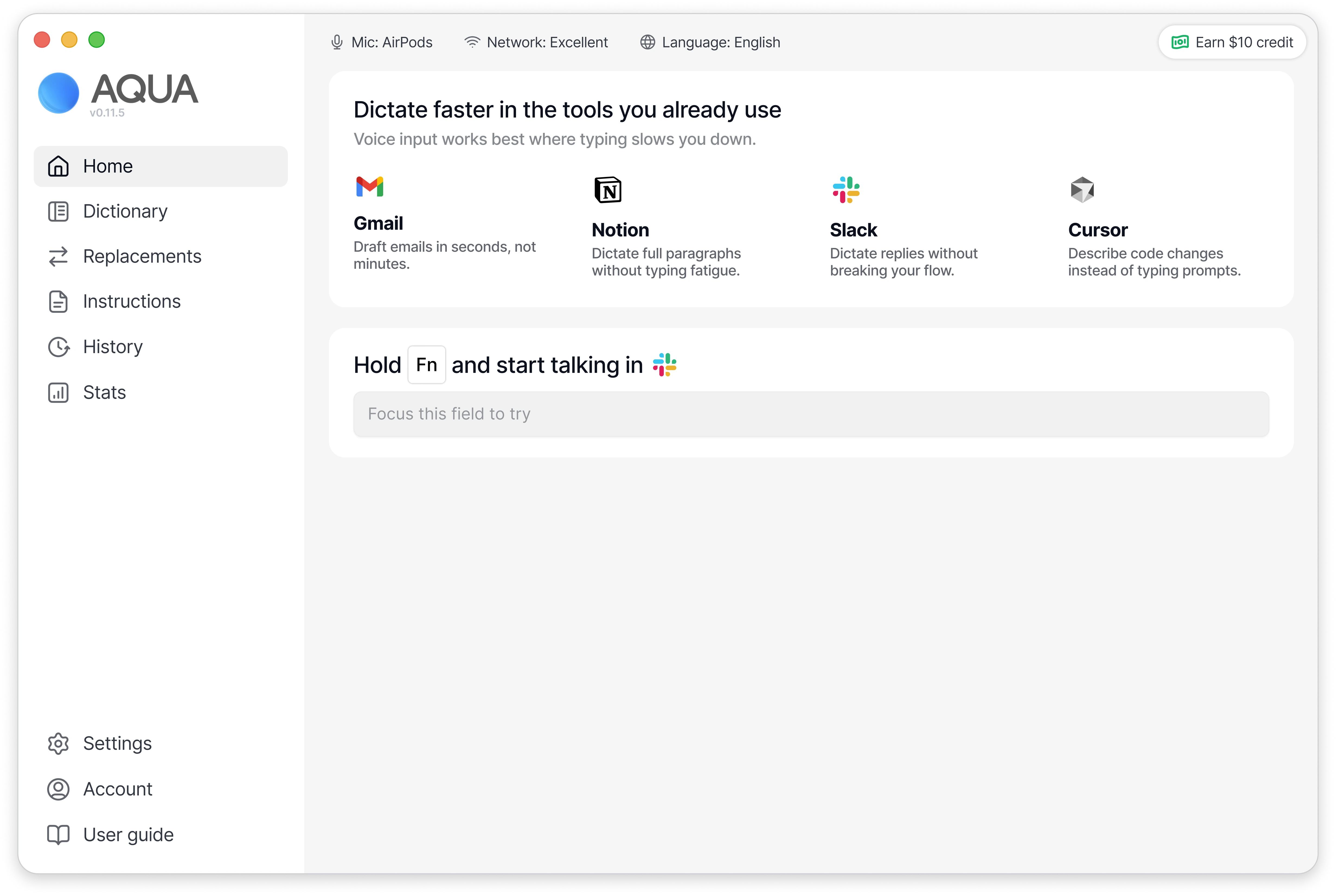
Value explanation and in-app tryout
I introduced a section that clearly explains where voice dictation saves time, showing real tools like Gmail, Notion, Slack, and Cursor. Below it, users can immediately test dictation inside the app, reducing friction between understanding the value and experiencing it.
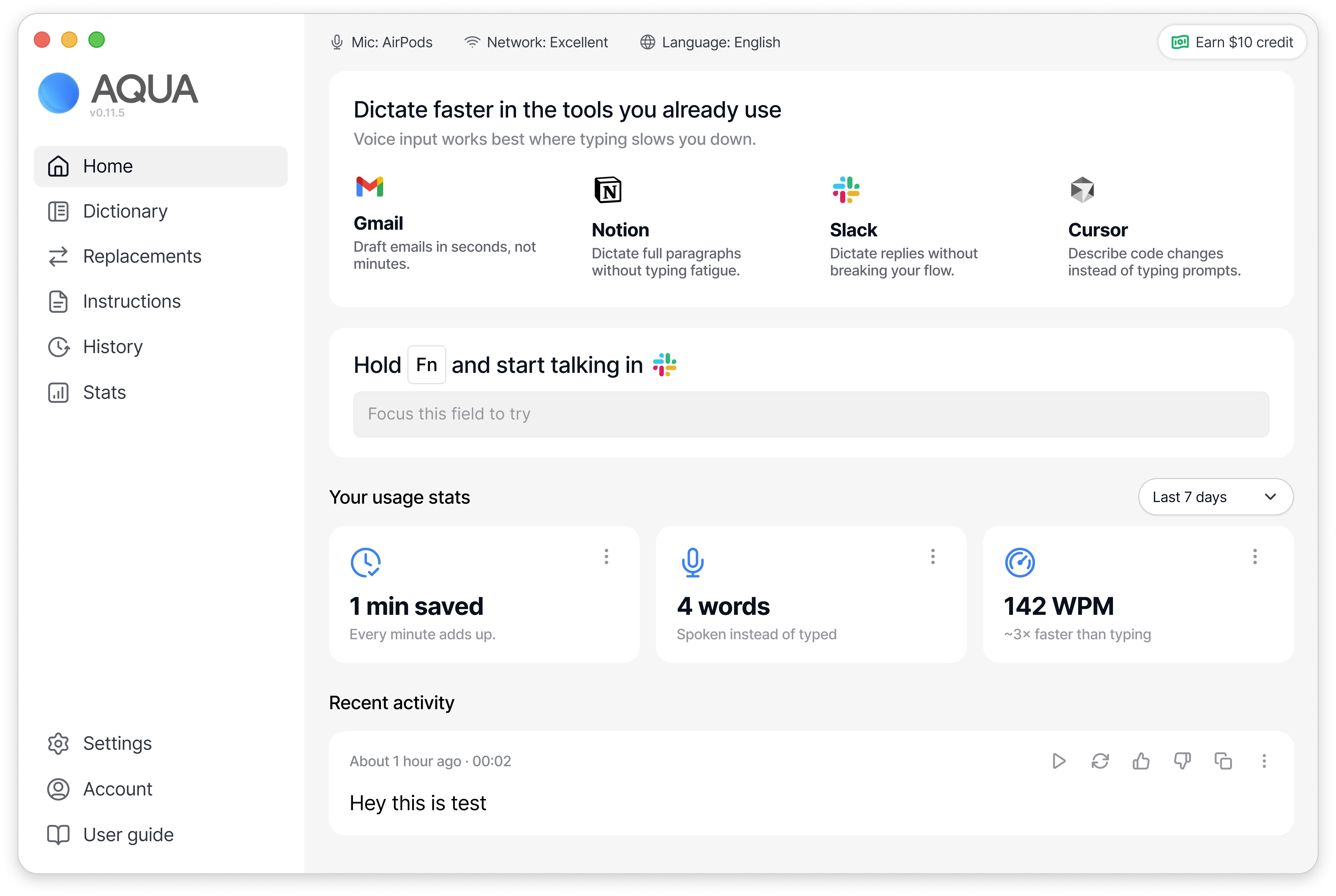
Engagement through visible progress
Even with minimal usage, the dashboard highlights time saved, words dictated, and typing speed. This gives users early positive feedback and encourages them to keep using the app instead of treating it as a one-time setup tool.
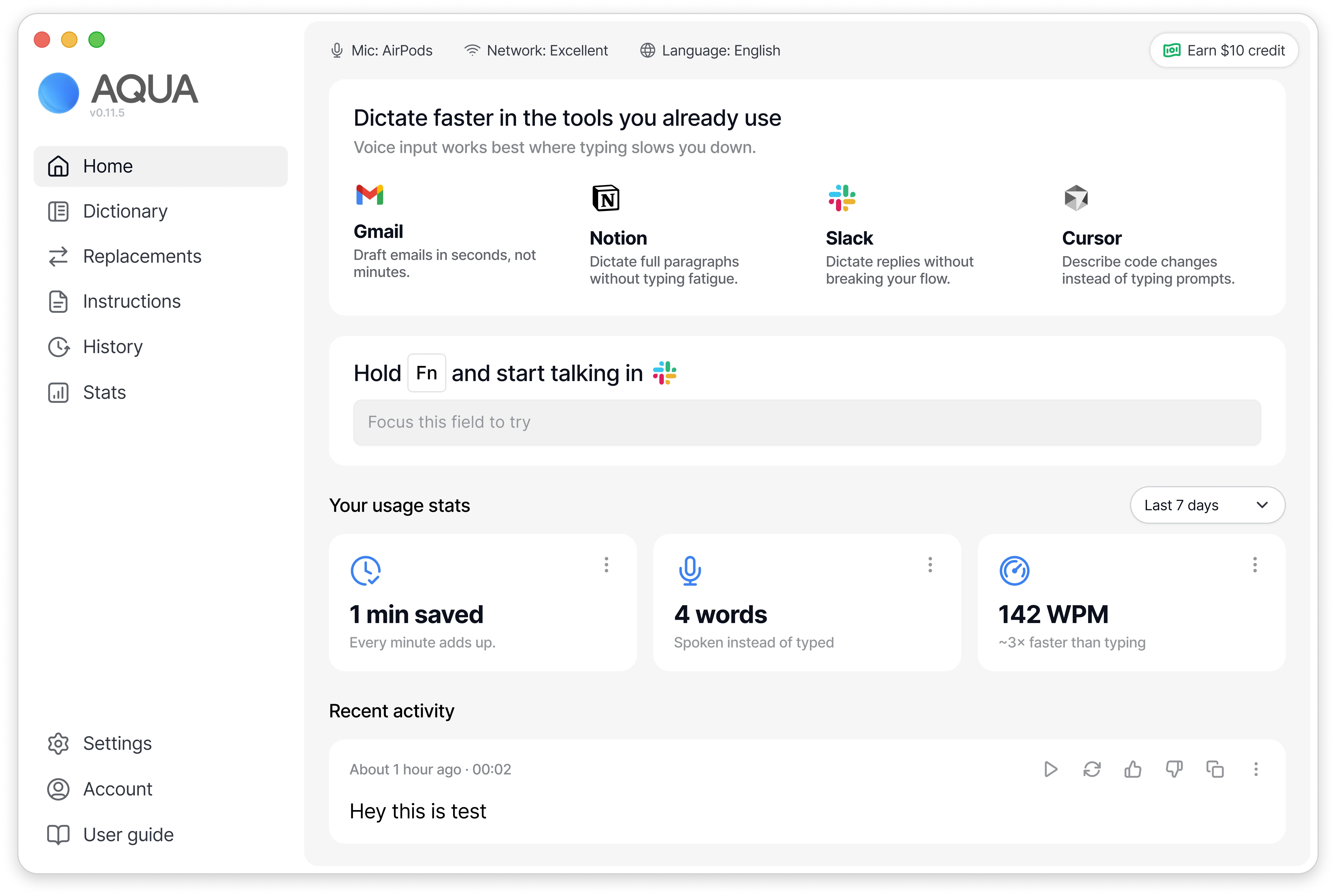
More modern and focused layout
I refined the layout to feel more aligned with native macOS patterns, using a cleaner white frame and softer rounded corners. This makes the interface feel lighter, more modern, and less like a technical configuration panel.
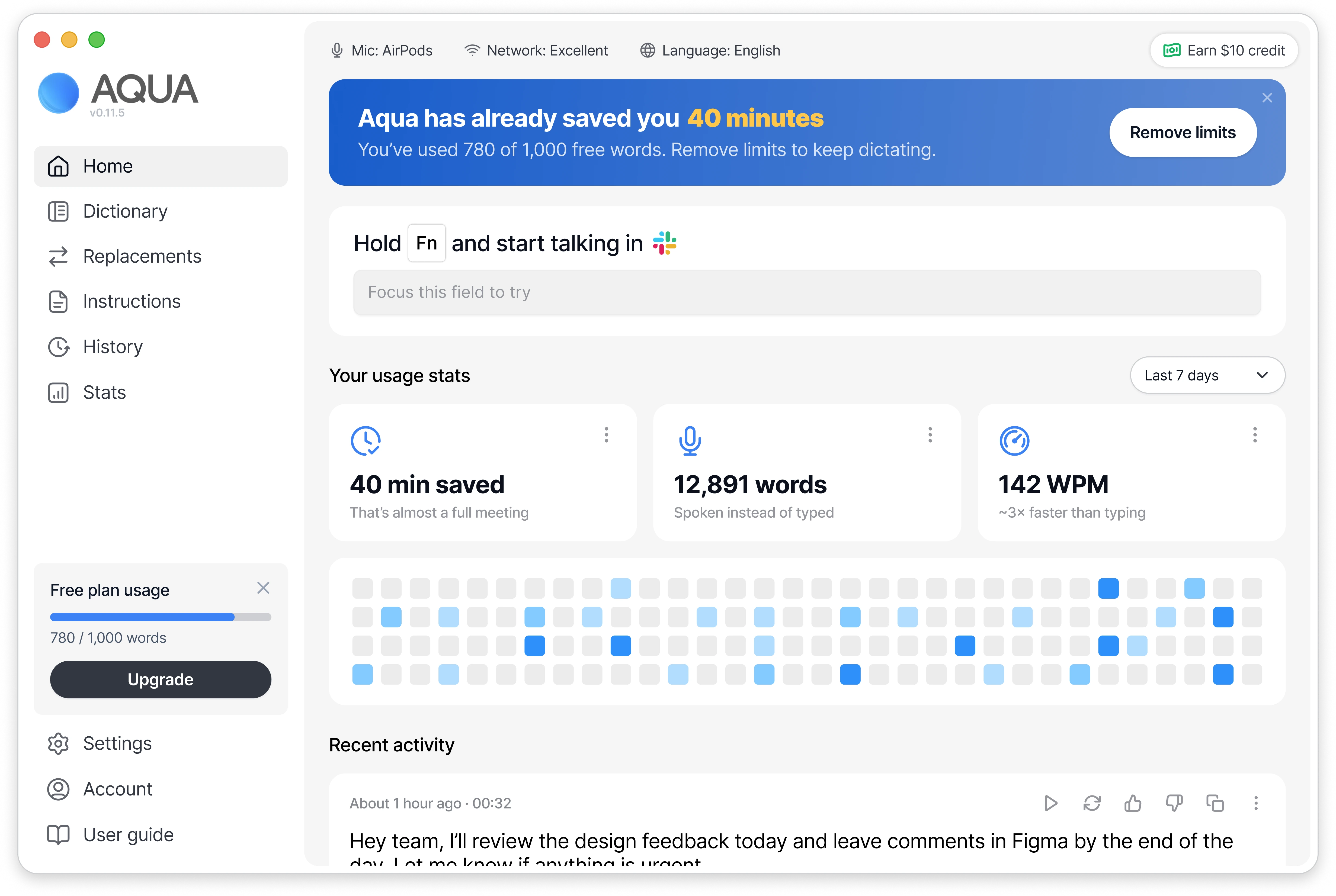
Mid-term user engagement and upgrade push
For users who have already used the app consistently, the dashboard evolves to show detailed usage data and free plan limits. A prominent banner highlights total time saved and connects that value directly to upgrading, framing the paid plan as removing friction from an already proven workflow.
Final outcome
A clearer dashboard for new and engaged users
After final adjustments and an additional dashboard state for engaged users, the direction was approved. The updated structure addressed product clarity while balancing user experience and business goals; the client responded positively to the result.
Summary
What this work changed
This work reframed the macOS dashboard around the value of the product rather than its configuration. The case in Figma documents the journey map, references, iterations and the approved direction, but does not include a measured post-launch impact.