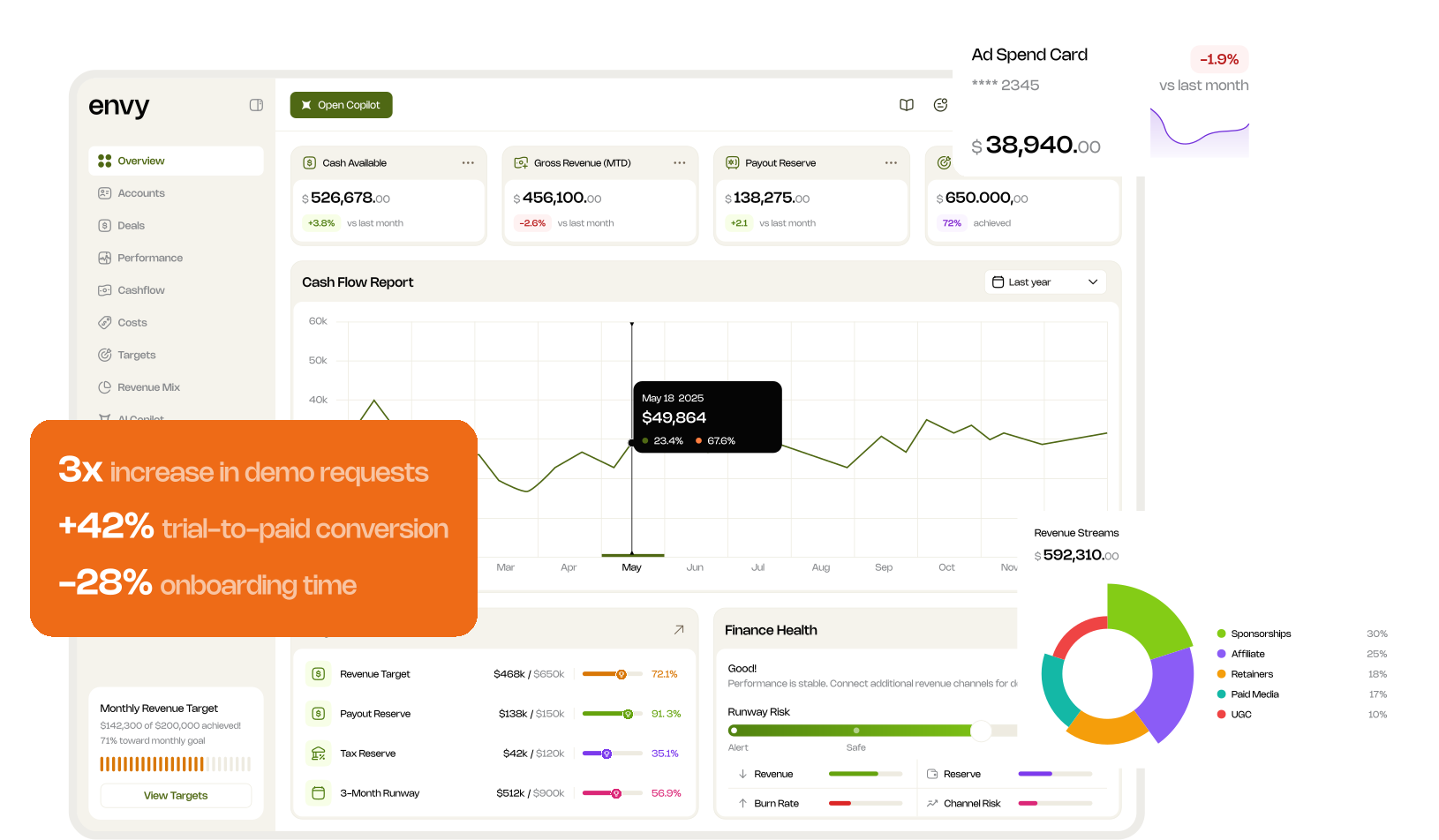


UX audit
Mapped user flows, identified friction points, and documented usability gaps in the legacy system.

Product Designer: UX, UI, interaction design and feature integration
The existing system was business-critical and built for internal operations, while the next version had to work for external customers.
Make the product clearer, more scalable and ready for onboarding, while respecting its existing logic.
The client approached me with a working internal financial management system used by their agency to track revenue, payouts, cash flow, and performance.
The tool was functional and business-critical, but it was designed for internal operations, not for external customers. As interest from other agencies started to grow, the team decided to evolve the product into a scalable, market-ready SaaS solution.
My task was not to redesign from scratch, but to carefully transform and mature the existing system into a clear, structured, and commercially viable product experience.
Starting point
This was the product before the redesign phase. It was operational, stable, and already used by real teams. However, it was built primarily for internal use, and the next step was to transform it into a polished, market-ready SaaS platform.
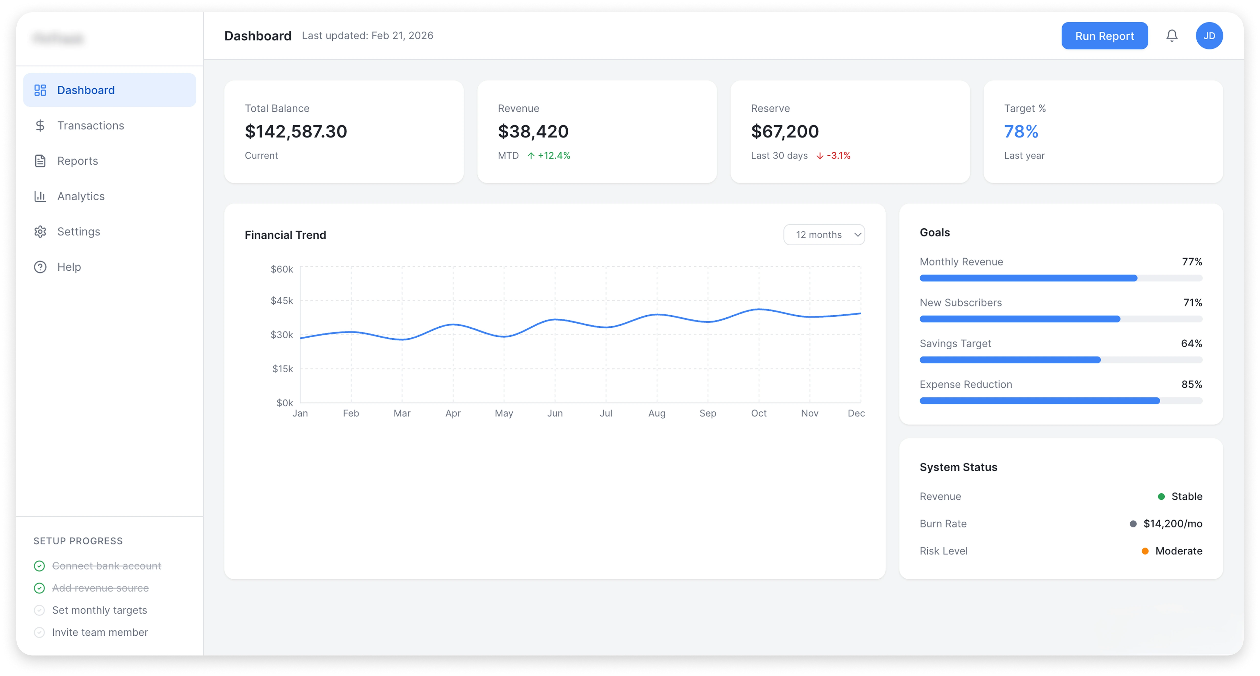
Structure and research first, visual after.
Mapped user flows, identified friction points, and documented usability gaps in the legacy system.
Aligned business goals with product direction and clarified what to keep, improve, or remove.
Analyzed existing architecture, data structure, and technical constraints before proposing changes.
Reviewed similar SaaS finance tools to understand industry standards and differentiation opportunities.
Reorganized navigation, dashboard hierarchy, and module grouping to reduce cognitive load.
Defined typography, color logic, and scalable component patterns for a product-ready experience.
After research and alignment, I moved into iterative improvements: first the structure and navigation, then the individual modules and visual consistency. These screens show how the existing tool evolved into a more coherent product experience.
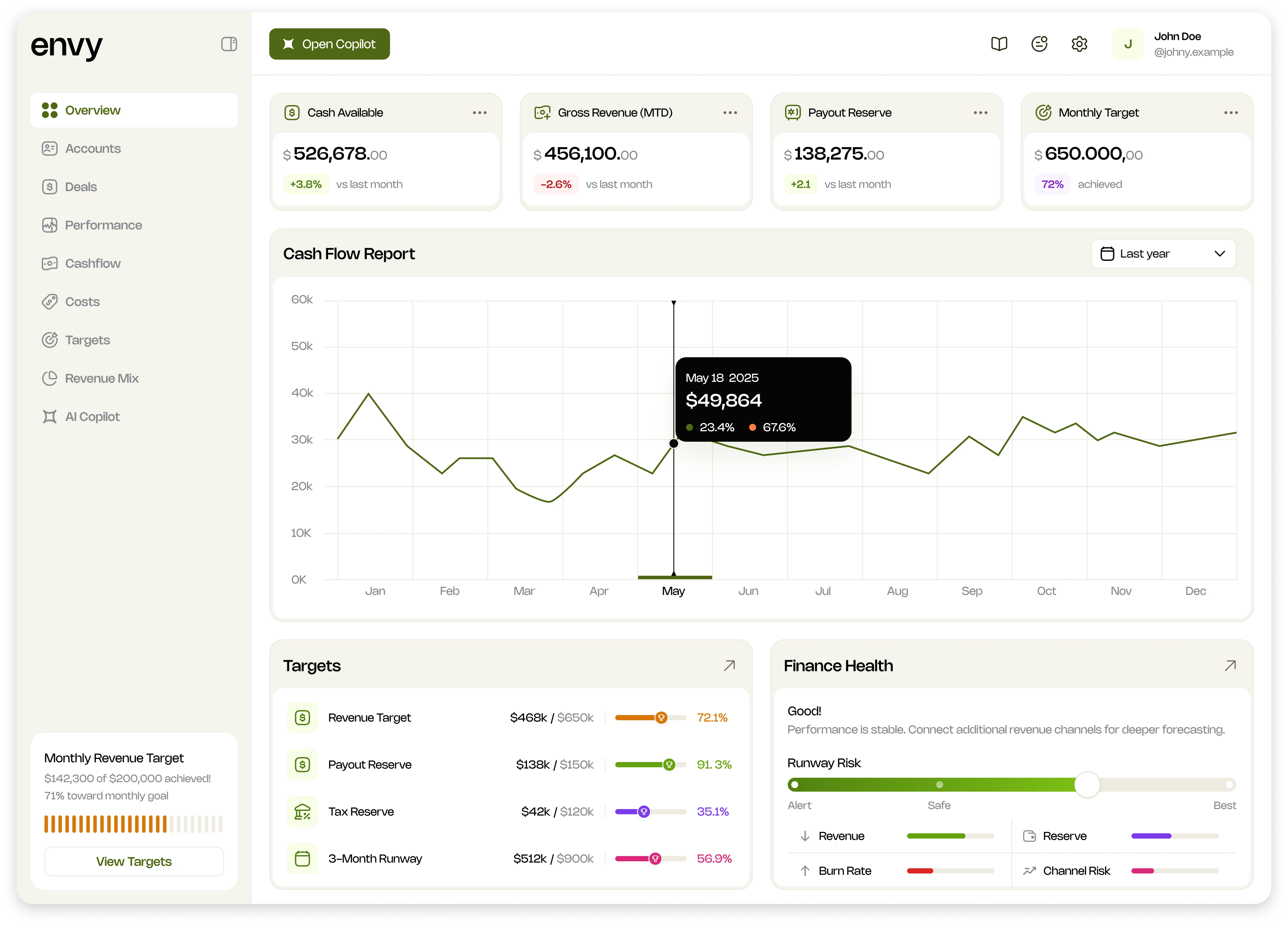
The main decision-making dashboard, redesigned to prioritize key financial metrics, improve hierarchy, and reduce cognitive load.
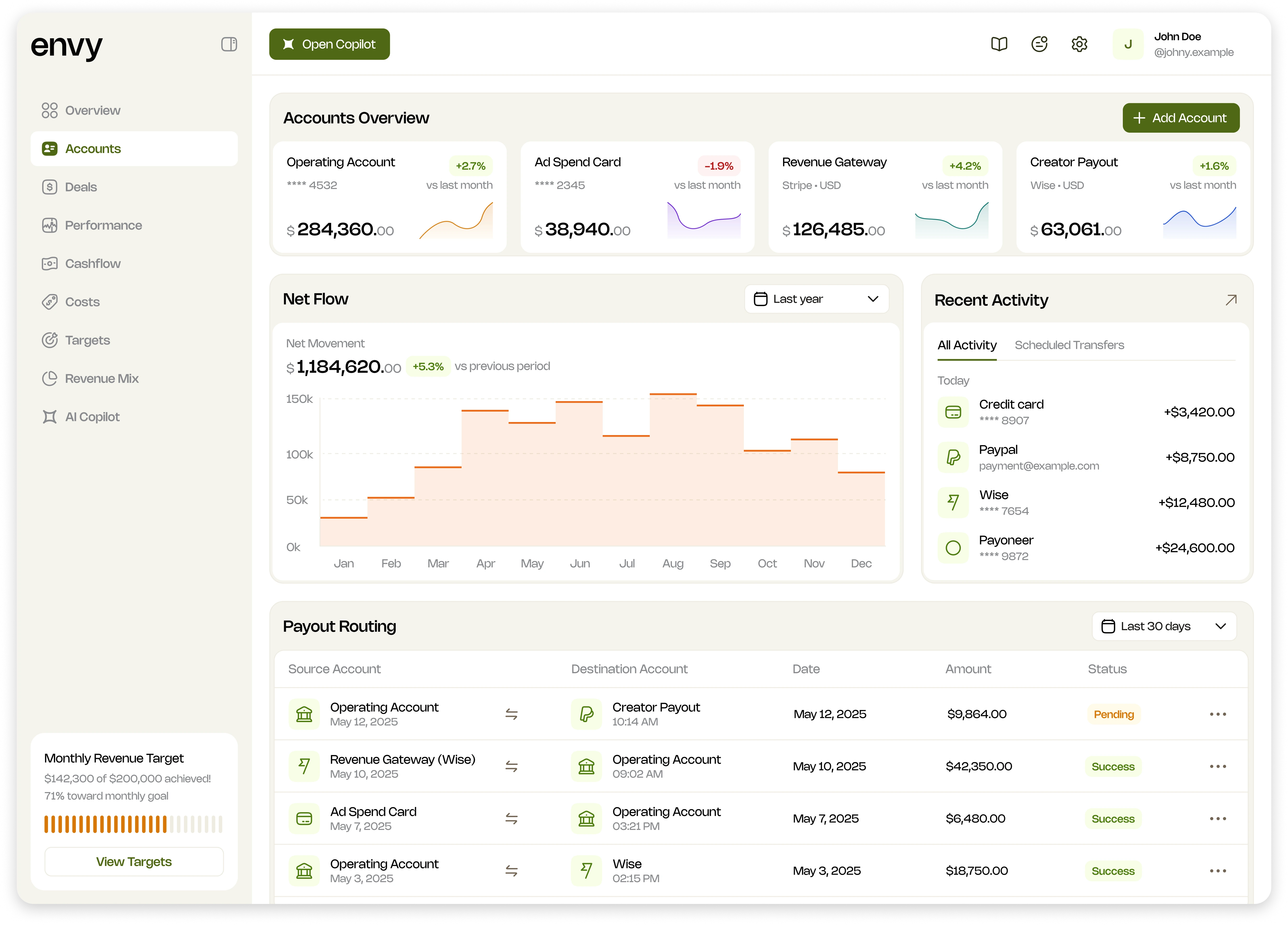
A structured view of financial accounts and cash movement, redesigned for clearer tracking and faster operational control.
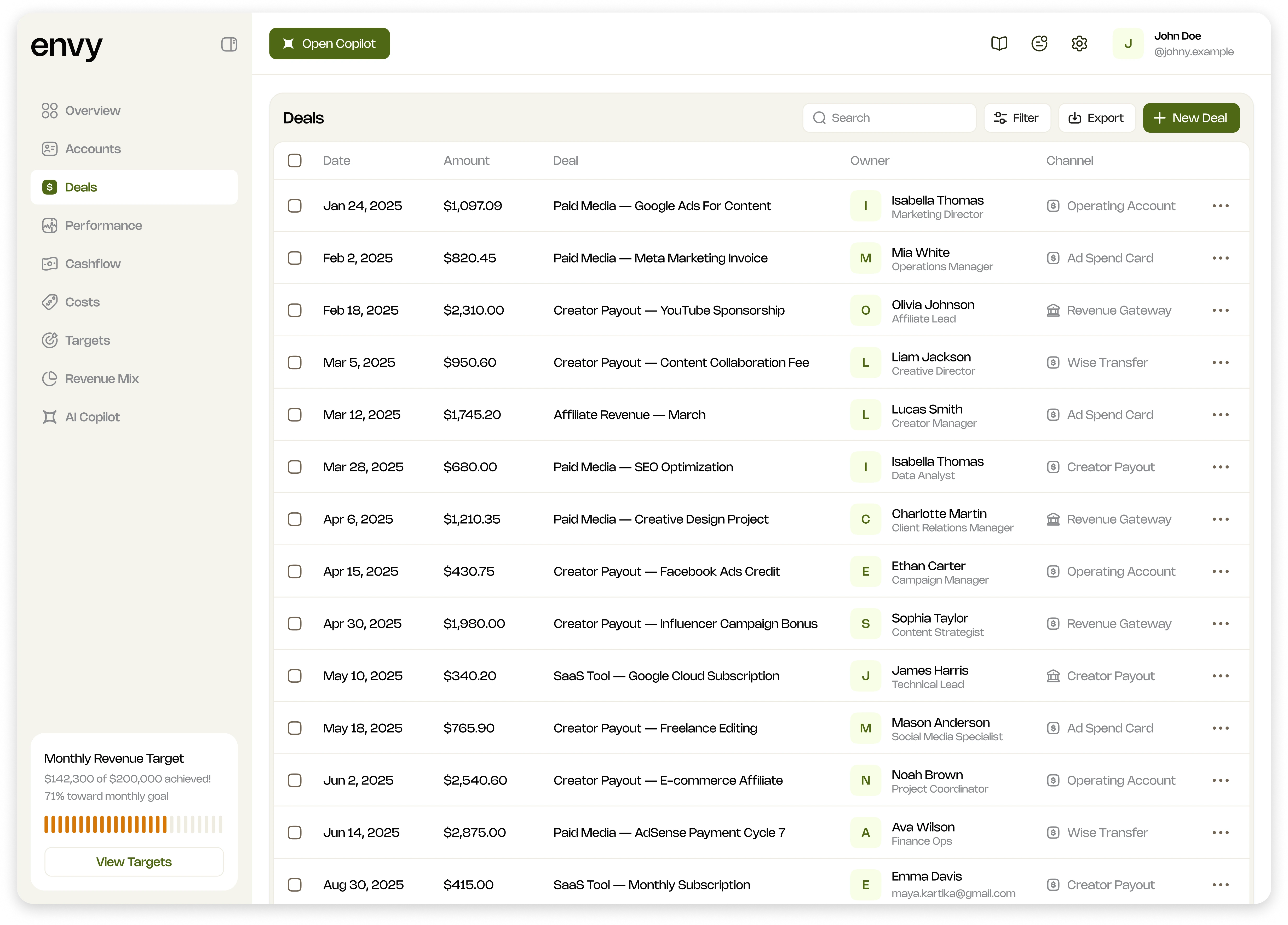
Deals connect revenue with the work and people behind it, so the team can inspect more than a headline number.
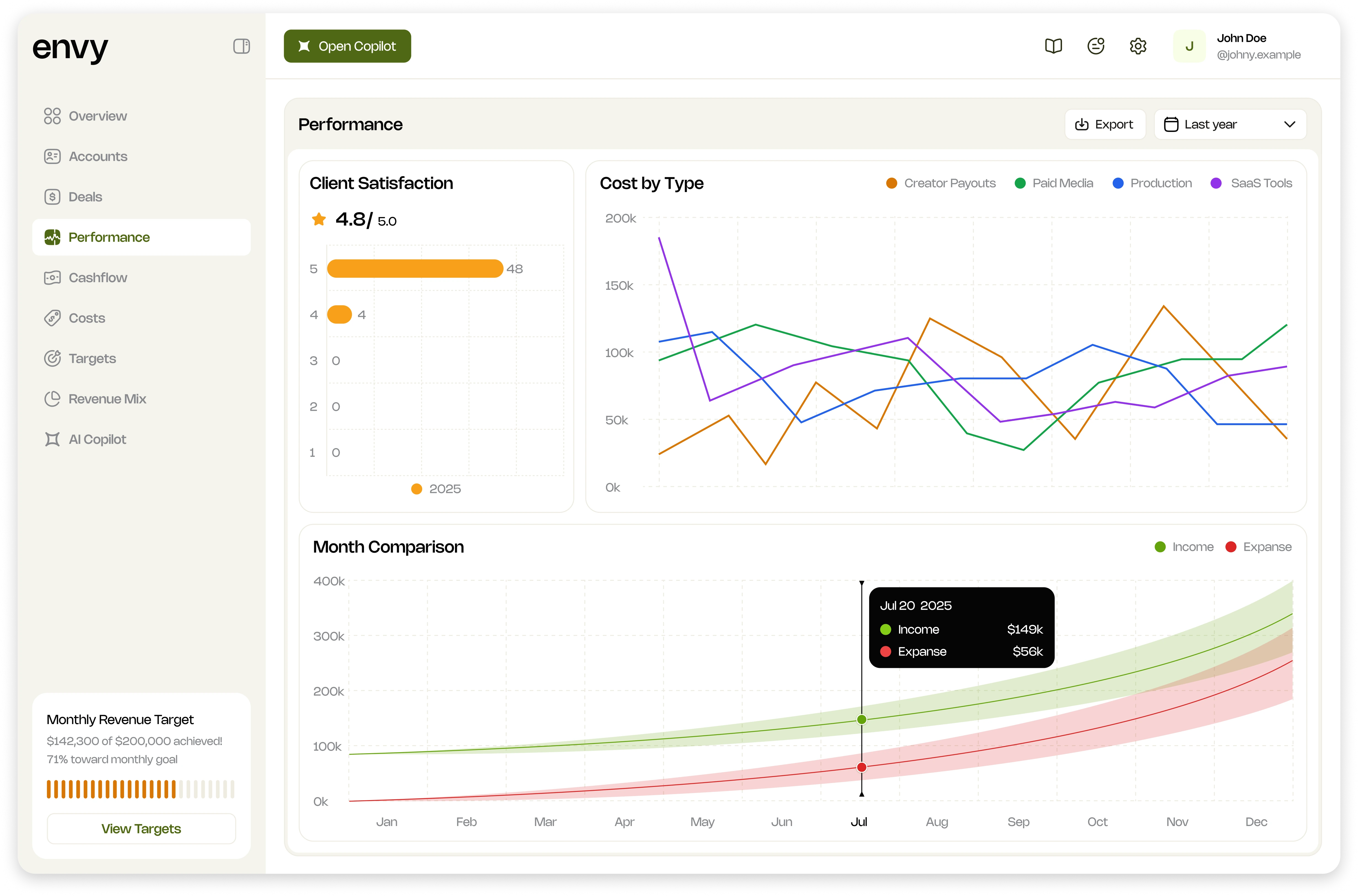
The reporting views separate overall performance from the composition of revenue, making dense financial information easier to follow.
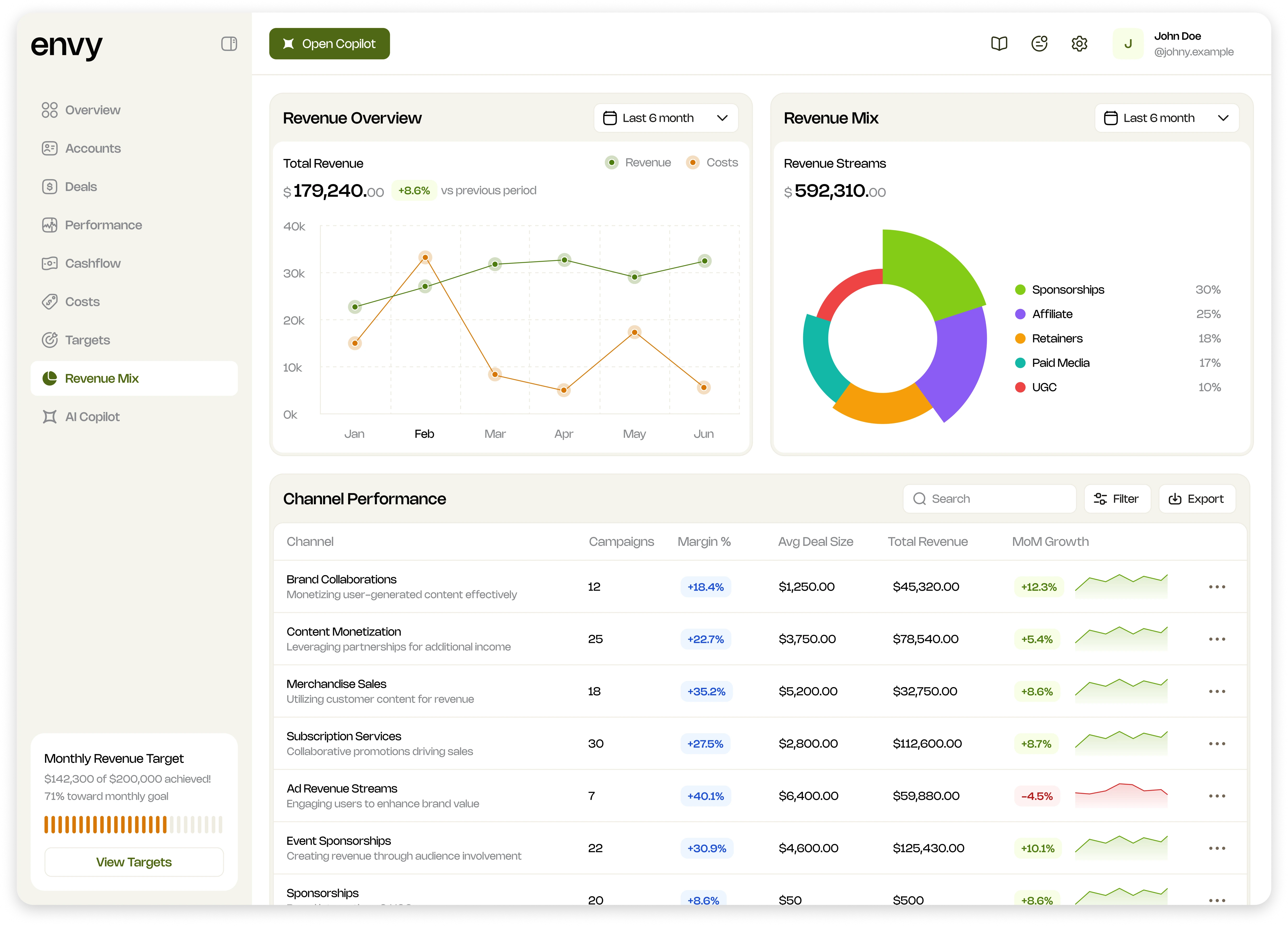
A dedicated revenue mix view helps people compare sources and see changes over time without rebuilding that picture from separate reports.
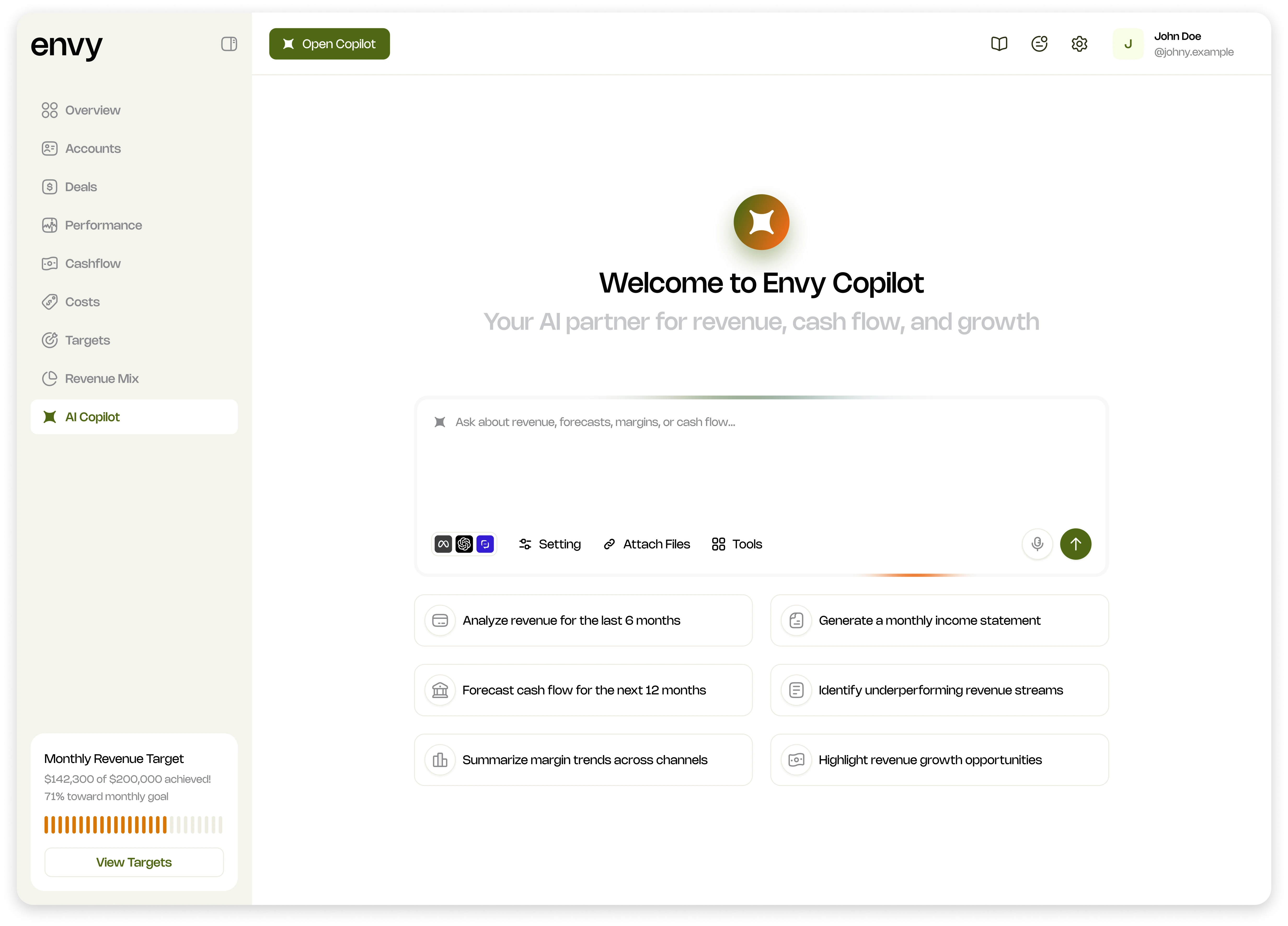
I also explored an AI copilot as a way to ask questions about the financial data. This was a design direction, not a claim of a shipped feature or measured result.
Summary
Envy is a story about product evolution: making an existing, operational finance system easier for a wider audience to understand and use while preserving the workflows already embedded in the business.


